Improving the Early Discovery Funnel
The drop-off wasn’t one broken screen — it was one screen serving two different intents. New-user discovery already works. The real opportunity was a home that recognises returning intent.
The Brief
Shaka Guide is a GPS-based audio tour app. Users browse, purchase, and download tours that play automatically as they drive or walk. The brief: review the early app experience (app open → home → discovery → tour detail page) and propose how to get more users to a relevant tour detail page. A meaningful drop-off was visible before users reached that page.
This was a paid 15–20 hour design trial with real funnel data. I was asked to diagnose the problem, identify user intent patterns, and propose a focused UX/UI direction.
🌞 View Figma FileThe Funnel Data
The 60-day blended funnel showed a meaningful drop before users reached a tour detail page. But blended numbers hide the story — so the first thing I did was split every step by new vs. returning users.
| Funnel Stage | All Users | New (55%) | Returning (45%) |
|---|---|---|---|
| Launch → Home | 87.8% | 93.0% | 81.5% |
| Home → Product View | 72.1% | 84.7% | 54.5% |
| Product → Purchase | 39.0% | 44.6% | 27.0% |
| Launch → Purchase | 24.7% | 35.2% | 12.0% |
The Diagnosis
New users: Discovery already works
93% reach home. 84.7% go on to view a product. Their real leak is Product → Purchase — out of scope. There’s limited upside in “fixing” new-user discovery; it’s largely working.
Returning users: A measurement mismatch
Only 54.5% reach a product view — but many aren’t trying to shop. They open the app to resume a tour, access a download, start navigation, or listen to audio they already own.
The composition effect
The blended 72.1% is dragged down by a large returning cohort with different intent. A “product view” was never their goal — so counting them as a funnel drop is partly a measurement mismatch, not a broken screen.
The real problem
The home screen serves one discovery-shaped experience to everyone. It does almost nothing for the returning user who came back with a specific goal in mind. ≈10,000 returning users are lost here.
What I Saw In the App
- The detail page already sells. Photo/video carousel, audio preview, “Trusted by 7,000+”, 4.7★ from 538 reviews, clear price, obvious Buy Now. The problem is getting people to it — not the page itself.
- Signing in barely changes anything. The logged-in home is almost identical to guest. The only addition is a “Recently Viewed” row. No “Continue”, no “My Tours”, no history-based picks. The product doesn’t adapt to why a returning user came back.
- Tour cards give you almost nothing to act on. Photo + title only — no price, rating, duration, or number of stops. Everything needed to judge a tour already exists on the detail page, but cards don’t surface it. Since a Product View = a card tap, weak cards are a direct drag on the metric.
- Real tours sit deep in the scroll. A “10 Years” banner, Discover tiles, and Destination Spotlights all appear before the first tappable tour. A lot of orientation cost before anything shoppable shows up.
- Navigation overlaps itself. Category chips, Discover tiles, island tiles, and bottom tabs all route to similar places — many paths, no clear “start here.”
Four Intent Patterns
Grounding the funnel in behaviour, I identified four intent patterns. One of them is structurally different in kind — and the product was ignoring it entirely.
The Decided
Knows the destination, wants the fastest path to a detail page. Search → detail works for them today.
The Orienting
Has a trip but not a tour. Needs ratings, duration, and comparison cues to narrow the shortlist.
The Explorer
No fixed plan yet, deciding if the app is worth it. The current home doesn’t give them a strong “start here.”
The Owner / Resumer
Already bought. Opened the app to resume, download, or navigate — not to shop. ≈10,000 showing up as “drops” in the data.
The Direction — An Intent-Aware Home
Returning users: Serve the goal first
“Continue / My Tours” at the top of the home — resume the tour they’re mid-way through (with a progress bar and one-tap Resume), owned tours with the right verb per state (Resume · Navigate · Download), and history-based “Keep planning” picks. Discovery stays available, just lower. This routes owners straight to what they came for — converting ≈10,000 “lost” users into people who reached their actual goal.
New / guest users: Strengthen discovery with enriched cards
The cheapest high-impact change. Every card surfaces rating, price, duration, number of stops, and a drive/walk badge — all data that already exists one screen deeper on the detail page. The same enriched card powers home, All Tours, and search. Whole-card tap matches the card-tap = Product View definition exactly.
Consolidated navigation
Overlapping chips, Discover tiles, and island tiles collapse into one filter bar (Region / State / Nearby + Filters) and one category rail. Tabs re-scoped: Home · Tours · My Tours · Explore — so “browse tours” vs “read content” is no longer blurry. A denied location permission no longer dead-ends; the home leads with the last-planned destination instead.
Before & After
Two problem areas, two targeted fixes. The home screen ignores returning intent; the discovery cards hide the information needed to act.
Home screen — returning user
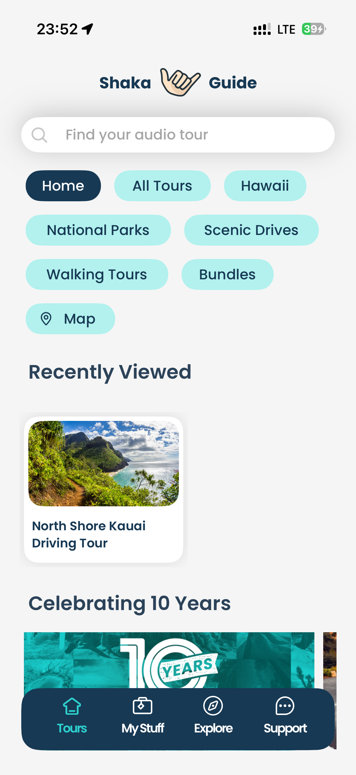 Before
Generic discovery home. No resume, no owned tours. Returning users see the same view as guests.
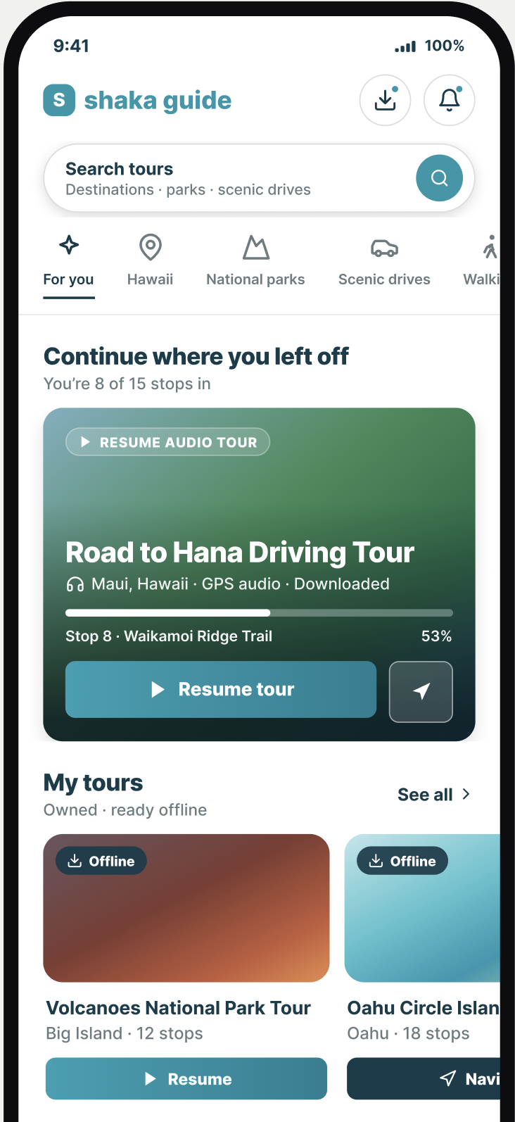 After
After
Intent-aware home. Resume + progress at the top, owned tours below — discovery stays, just lower.
Tour cards — discovery
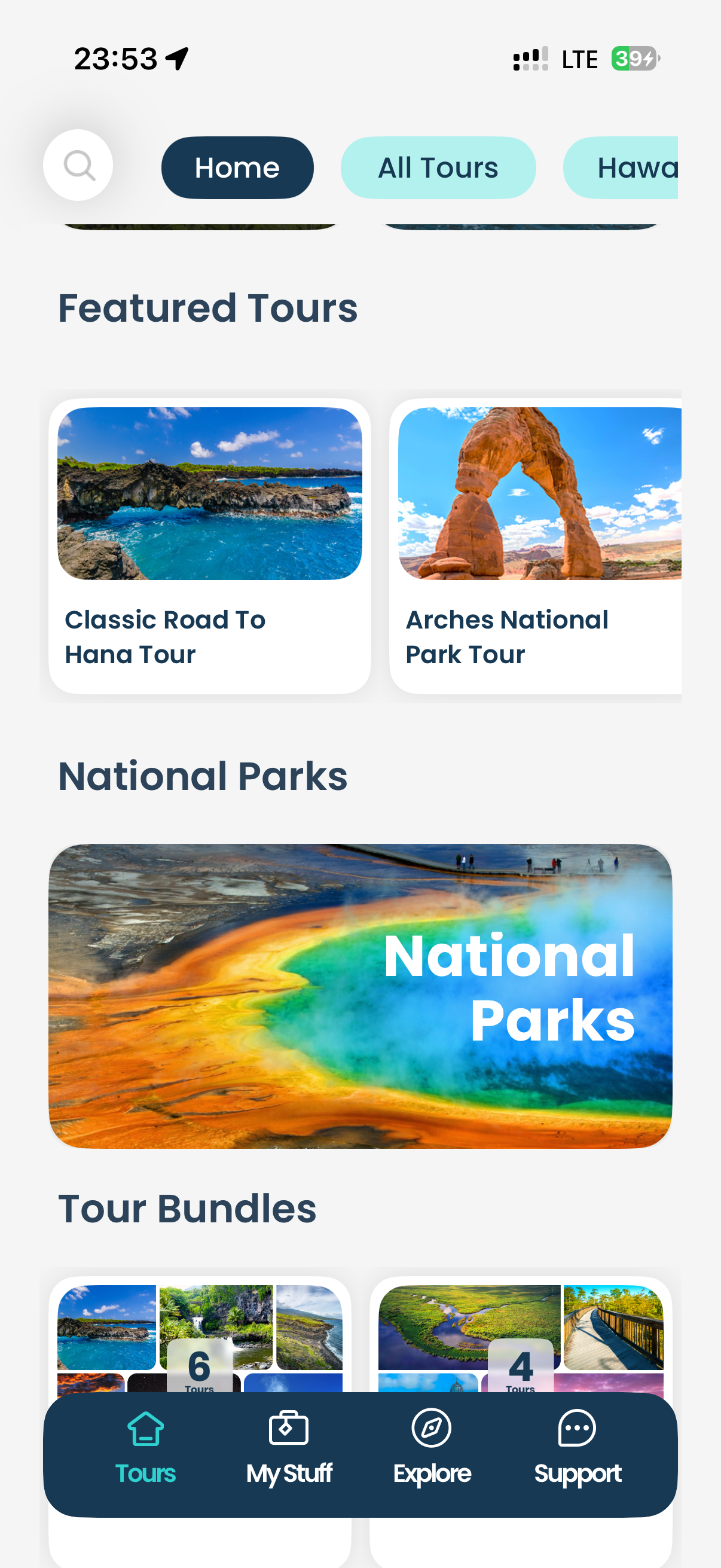 Before
Cards show photo + title only. Rating, price, duration hidden one tap deeper.
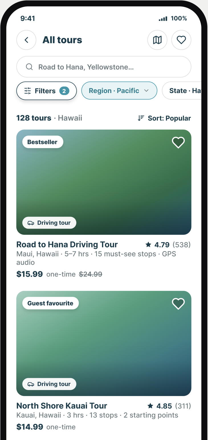 After
After
Enriched cards surface rating, price, and type upfront. Everything needed to decide without tapping.
Prioritisation
| Priority | Opportunity | Who it helps | Impact |
|---|---|---|---|
| First bet | Intent-aware home (returning first) | Returning · ≈10k gap | High |
| Supports A | Enrich tour & bundle cards | New + planners | High |
| Next | Reorder discovery home | New + planners | Med–High |
| Later | Clarify tours vs content, trim nav | All | Med |
| Later | Nearby / location fallback | Planners | Med |
What I deliberately didn’t touch: onboarding, purchase/checkout, pricing, post-purchase, and audio/tour-start — all out of scope. I also resisted “fixing” new-user product-view rate (84.7% is already strong) and resisted pushing returning owners toward product views — that’s the wrong goal for them.
Design System
Airbnb Patterns, Shaka Brand
Reused Airbnb’s mature marketplace patterns — 16px photo cards, soft shadows, round-pill chips, whole-card taps — recolored to Shaka’s teal (#1C97AB) and navy (#123C4C). A trustworthy language users already know, made native to the brand.
Booking-Grade Trust at Card Level
Ratings to two decimals, 2px line icons (star & heart), plain-spoken microcopy (“Show map” not “SHOW MAP”), one-time price with strikethrough MSRP. Every cue already lived on the detail page — the card just surfaces it.
Reusable Everywhere
The enriched card component is one recolour of a mature design system. It extends consistently to home, All Tours, search, and bundle cards — no bespoke one-off work required.
How I’d Measure Success
- Returning users: “Reached intended action” — resume / download / navigate. Leading signal: taps on the Continue / My Tours surface. Not product-view rate.
- New / discovery users: Home → product-view rate and card tap-through by section.
- Guardrails: Don’t slow the Decided user’s fast path; don’t let view-to-purchase quality slip.
- Method: A/B the new home vs control, always reported split by segment — a blended readout would understate the returning win (and is how the problem was hidden in the first place).