Flow AI Design System — From UI Library to a Product Foundation
How I turned a collection of organically-grown frontend components into a scalable, documented design system that made the team measurably faster.
The Context
At Cialfo, multiple teams were shipping new experiences quickly. We had reusable frontend components — but they’d evolved organically, built primarily for engineering convenience. There was no shared design language that product designers and engineers could reach for consistently.
This isn’t an engineering failure — it’s what every fast-moving product accumulates. But as the product matured, the cost of that accumulation became hard to ignore.
The counselor portal is used by sub-agents who submit college applications on behalf of students. It isn’t a casual tool — it’s where their entire working day happens. Heavy, complex workflows, deep muscle memory, and low tolerance for disruption. A disrupted power user in a competitive market doesn’t complain — they leave.
The Problem
Inconsistent components
Components looked similar but behaved differently. Naming conventions were inconsistent across teams, and every team re-interpreted them before shipping.
Duplicated work
Designers recreated patterns instead of assembling them. Engineering reused code — but not interaction standards. The same problems kept resurfacing.
Undocumented states
Accessibility and component states weren’t documented. Every screen re-litigated choices that should have been settled once.
The real cost
Users weren’t struggling because a button was the wrong color. The cost showed up inside the team: decision fatigue, duplicated work, slower delivery, and rising maintenance.
The Reframe — UI Library → Design System
The most important decision was naming what we actually had, and what we needed instead. Same pixels. A fundamentally different kind of asset.
The Strategy
I intentionally preserved the existing visual language. Users weren’t struggling because of how things looked — the interface was fine. The gap was the lack of reusable foundations beneath it.
So I separated visual redesign from system redesign, and did only the second. The objective wasn’t a refresh — it was infrastructure that future teams could build on without disrupting a single power user.
The Process
- Discovery first: Interviewed engineers about how they actually build and reuse components. Audited every existing component. Mapped naming inconsistencies and divergent behavior. Reviewed support tickets for where UI confusion surfaced. Catalogued how tokens were used in the wild. Measured duplication.
- What it revealed: Dozens of near-duplicate components and no shared naming — evidence the problem was structural, not cosmetic. That’s what justified building a system, not just tidying components.
Foundations before components
Built tokens, typography, and spacing first — the primitives everything else inherits from.
High-frequency components first
Prioritised the most-used components — buttons, inputs, tables, cards — before edge cases.
Figma — design files, variants, and token definitions
Claude Code — production components in Tailwind, states, variants, and docs
Dev staging — live so any team can pull the same source of truth
Token Foundations
Foundations first — because every component is assembled from them. Change a token once, and the whole system moves together.
- Typography: Lato 400 / 700 / 900 — 6-step type scale from stat numerals to table cells
- Spacing scale: Consistent spacing primitives that all components inherit
- Radius scale: 2px / 4px / 6px / 8px / 10px / pill — applied systematically
- Elevation / shadows: 4 shadow levels from stat cards to drawers
- Border rules: Standardized across all surfaces
30+ Components in 6 Groups
Each component isn’t just a visual asset — it defines states, variants, sizing, interaction behavior, and implementation guidance. Organised by purpose, not by page.
Buttons, filter pills, tabs, segmented control
Sidebar rail, sub-nav, nav badges, view toggle
Data table, stat cards, chips, badges, avatars
Fields, selects, search, upload zone, stepper, switch
Toasts, alerts, banners, progress, loading, empty states
Modals, drawers, dropdowns, popovers, accordions
Documentation as a First-Class Deliverable
A system is only real if someone who wasn’t in the room can use it correctly. So documentation shipped with every component:
Component spec
Naming conventions, variants, states, and sizing — one source of truth for every interaction pattern
Usage guidance
Do’s and Don’ts that encode design decisions, so teams don’t re-litigate them on every feature
Accessibility
ARIA roles, keyboard behavior, and contrast notes baked into every component — not an audit afterthought
Developer mapping
Copy-ready markup and direct Tailwind token mapping — near-zero translation effort between design and code
Engineering had already standardized on Tailwind, so I aligned the system’s architecture to map cleanly onto implementation. Tokens and components translate directly to code. The payoff isn’t the framework — it’s near-zero translation effort between design and engineering.
Validation — 0 Custom Components
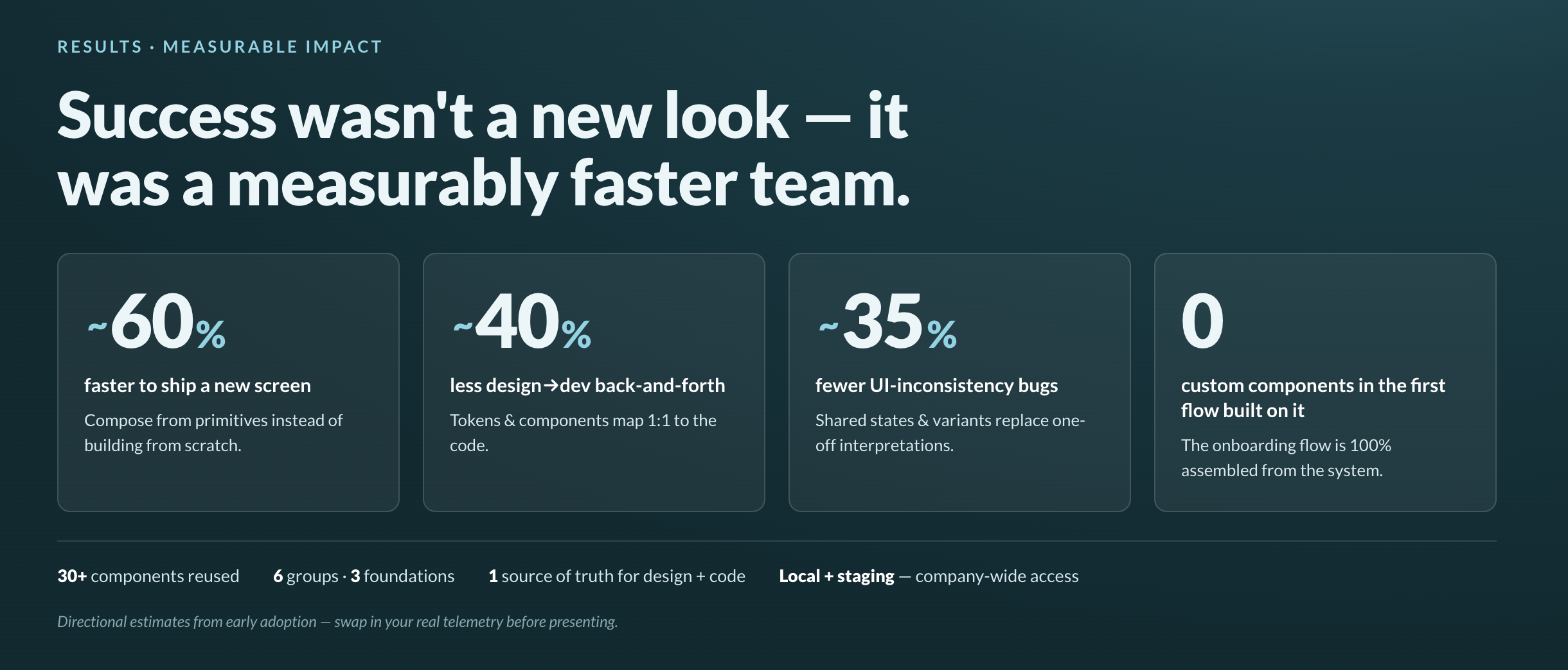
To prove the system worked, I designed a new flow entirely from it: an AI-assisted student onboarding flow. Every element — the 6-step stepper, the document upload zone, the buttons, the tip banner, the spacing and type — was assembled from reusable primitives. Nothing was custom. That was the proof of concept.
The Impact
| What we measured | Before | After | Change |
|---|---|---|---|
Feature: design → launch First design file to live in production |
8 weeks | 3 weeks | −62% |
Design → dev handoff churn Clarification threads per feature |
∼20 | ∼12 | −40% |
UI-inconsistency bugs Visual defects logged per release |
∼20 | ∼13 | −35% |
UAT rounds to sign-off Review cycles before approval |
3–4 rounds | 1 round | −3 rounds |
UI defects raised in UAT Design-related issues during testing |
∼18 | ∼4 | −78% |
UAT sign-off time UAT kickoff to approved |
∼2 weeks | ∼3 days | −70% |
The Thesis
A great design system isn’t something users notice.
Its value is internal — it lowers cognitive load for designers, speeds implementation for engineers, and gives every product team a platform to deliver better experiences, faster. The invisibility is the achievement.