OllieGo — Local Discovery for the Spontaneous Traveller
A take-home design challenge: design a mobile-first local exploration product for younger travellers. From indecision to confident action in under 60 seconds.
10 screens · Light + Dark mode · Tonight / Weekend toggle · WCAG AA compliant
The Brief
TripAdvisor challenged me to design 4–5 high-fidelity screens for OllieGo — a hypothetical mobile-first local exploration product for younger travellers, focused on evenings and weekends. The brief: treat it as a distinct product with its own audience, behaviours, and expectations. Time budget: 5 hours.
This is not a shipped product — it’s a design exercise. I delivered a fully navigable 10-screen prototype, a daughter-brand design system, a competitive analysis, and a metrics framework within the time limit.
The Problem
Already There, Still Stuck
50% of experience bookings happen after travellers arrive at their destination — but apps feel slower than asking a friend
Too Much Noise
Current mobile flows surface irrelevant options, hide key logistics, and demand repetitive form-filling right when users feel most rushed
Social Stakes
The “spontaneous decider” pulls out their phone in front of the group. They can’t afford a bad call — and they have no patience for friction
What They Need Right Now
A quick read on vibe, safety, how to get there, price, and whether it fits their time window — before committing
Research Inputs
- 50% of experience bookings occur after travellers have already arrived at their destination
- 75% of Tripadvisor app users engage with search — but digital flows feel slow and noisy compared to asking a local
- 10% use the map to find nearby recommendations — spatial context matters but isn’t being served well
- Younger travellers sketch a rough day but intentionally leave evenings unplanned to follow mood and opportunity
- In-person kiosks win on speed & confidence — the goal was to match that feeling in an app
Design Philosophy
Every decision in OllieGo ran through three principles derived directly from the research constraint: apps feel slower than kiosks. I used that as my primary design constraint.
Context over configuration
Never ask what can be inferred. Location, time, and area are already known.
0 manual location inputsOne decision at a time
Three questions, one screen each. The fastest path to a confident answer is a narrow one.
3 questions → result in <60sConfidence, not comprehensiveness
3 curated picks outperforms 30 options. Ollie owns the curation, the user owns the final call.
3 picks. Not 30.The Solution
10 screens. 5 distinct moments. Each screen solves exactly one decision.
Context Capture — 3 Taps, No Typing
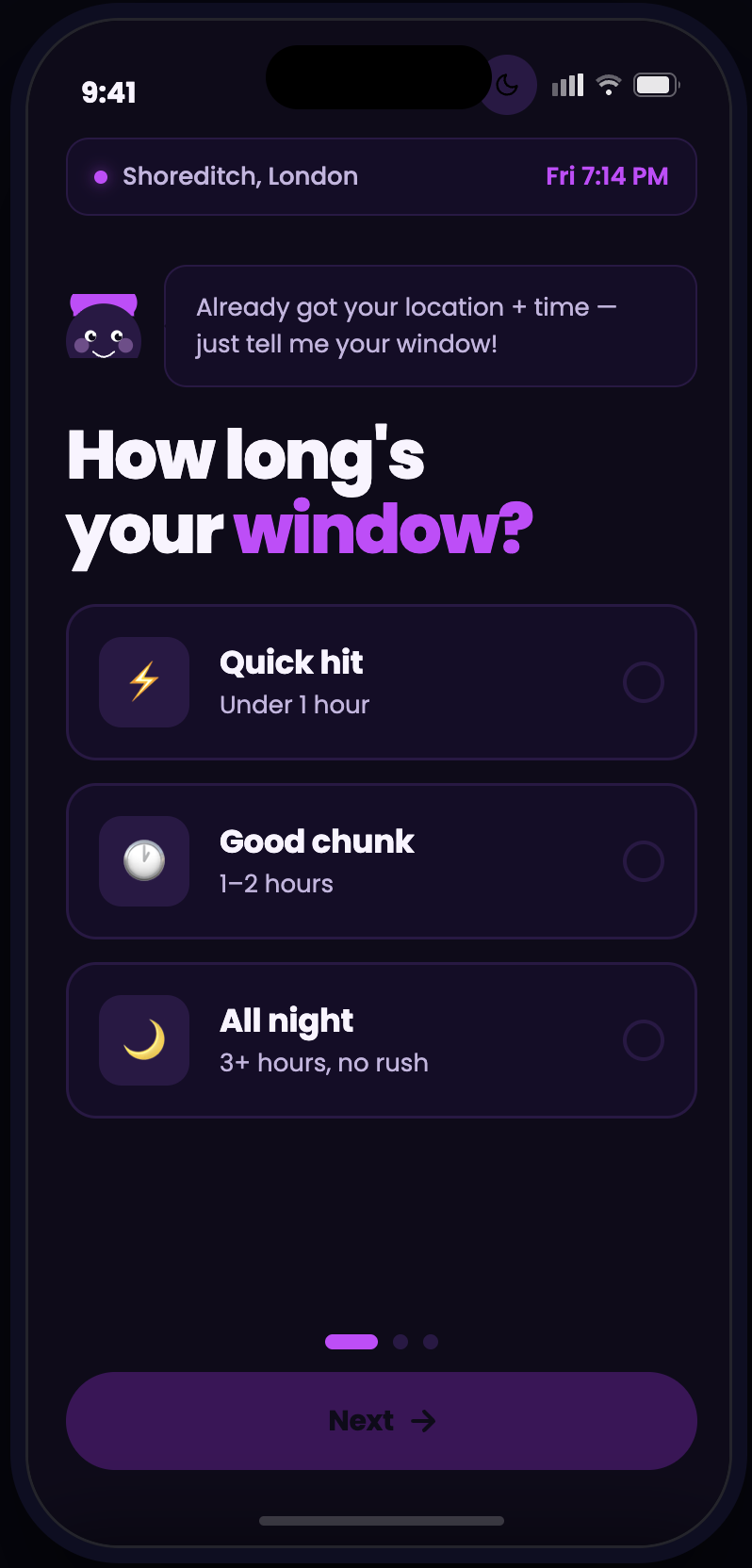
Three full-screen questions — time window, group size, vibe — each on its own screen with large tap targets and no keyboard. Location and time of day are inferred from the device.
Mirrors how you’d ask a friend: “How long have you got? Who’s with you? What’s the vibe?”
Curated Feed — 3 Picks, Not 30
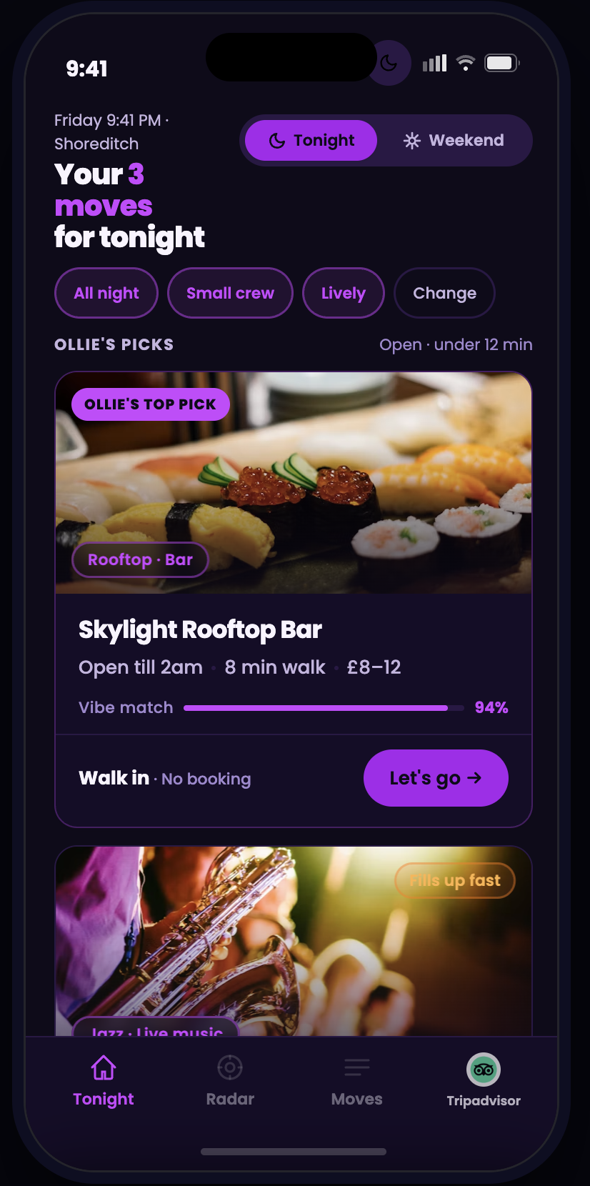
Exactly three venues ranked against live context: vibe match %, walk distance, open status, and live crowd signal — all derived from real-time data. A Tonight / Weekend toggle switches the entire surface with one tap.
More options create more anxiety. Three forces a decision. Ollie takes on the curatorial burden so the group doesn’t have to.
The Radar — Same Picks, Spatial Context
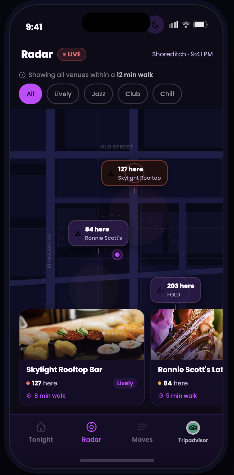
The same three curated venues on a live map. Pins show live crowd counts; a pulsing walk-radius ring marks the 12-minute catchment area. Tapping any pin brings the corresponding venue card into focus.
“127 here tonight” on a pin answers the question no star rating can — is this actually where people are going right now?
Decision-Maker Card — Everything Needed to Commit
Full venue view: photo carousel, live crowd, safety info, mini map, and one-tap booking. Group size carries over from context capture. Saved payment details from the TA account. One CTA — “Quick Reserve” — commits the booking.
By the time a user reaches this screen they’ve already said yes in their head. The detail page exists to confirm that instinct — not reopen the decision.
Design System — Daughter Brand, Not a Departure
Inherited Structure
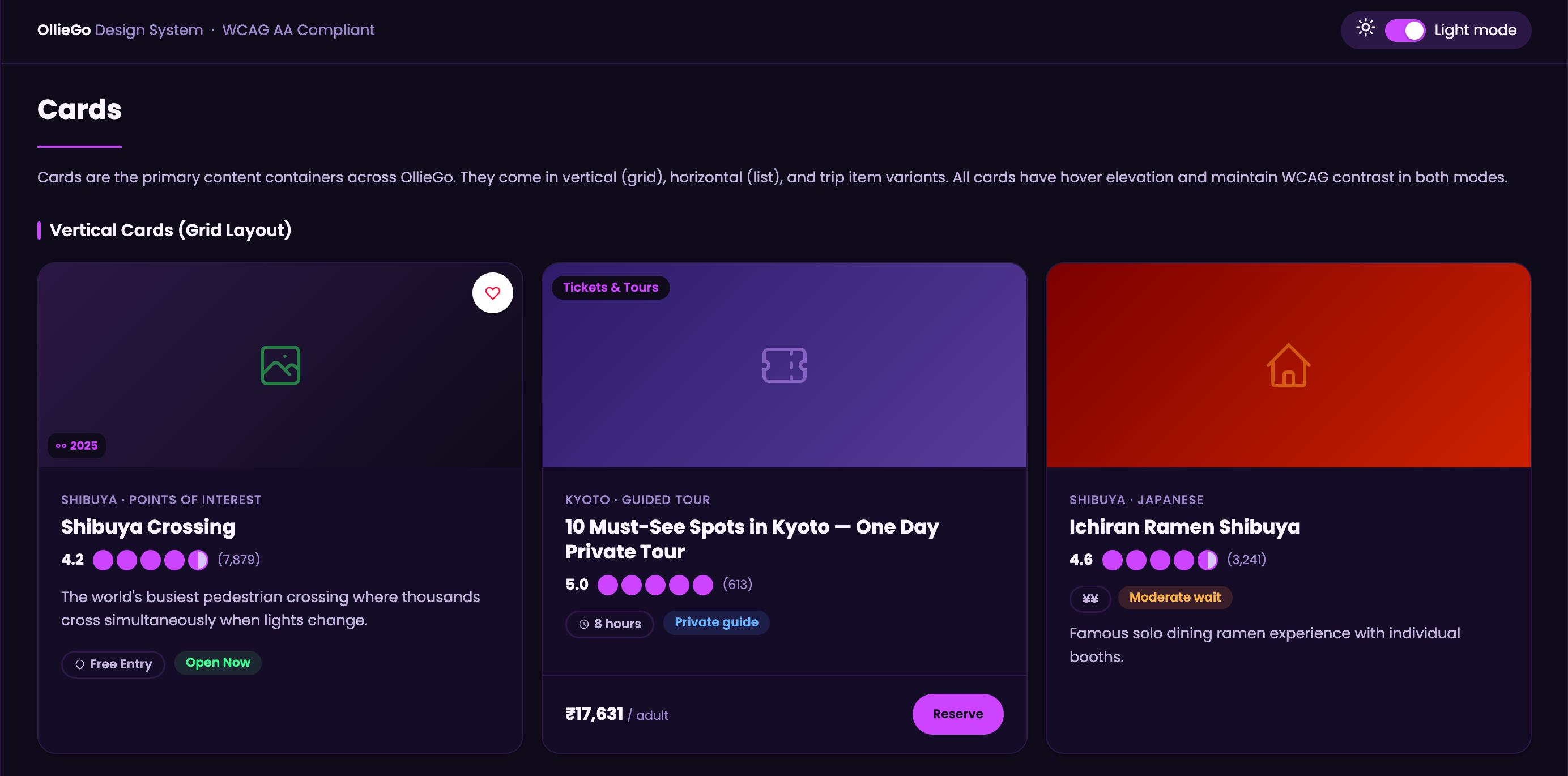
Every structural token from the TripAdvisor Design System — same type scale, same spacing, same button anatomy. OllieGo adds its own dark violet surfaces and electric accent.
WCAG AA Compliant
31 colour pairs verified. Poppins + Roboto Mono. Both light and dark mode fully implemented and accessible across all screens.
New Energy
Deep violet (#0F0B1A) surfaces with electric violet (#CC44FF) accent. The palette signals “this product was built for night” without departing from the TA family.
Competitive Landscape
vs. Google Maps
Google wins on general utility but requires manual search and offers no social trust or vibe-matching. OllieGo surfaces contextual picks before the user types anything.
vs. GetYourGuide / Klook
Pre-planned tour products with high checkout friction. Poor fit for spontaneous in-destination decisions. OllieGo is designed specifically for the “already arrived” moment.
The gap OllieGo fills
No competitor solves speed + trust + context simultaneously. OllieGo is the only product designed to resolve the spontaneous group decision in a single session, with live crowd and safety signals.
Metrics Framework
Targets are directional estimates based on comparable in-destination booking products and TA’s own engagement benchmarks. Final thresholds would be set collaboratively with the PM and Data Director after baseline measurement in a controlled pilot market.
What I’d Validate Before Shipping
- Does 3 picks feel confident or limiting? — A/B test 3 vs 6 vs 10 results, measuring booking rate and time-to-decision
- Does Ollie feel like a guide or a gimmick? — Sentiment testing, NPS vs TA baseline, mascot perception study
- Does social proof drive urgency or anxiety? — Qualitative interviews with target persona in-destination
- Is 60 seconds achievable end-to-end in the field? — Time-to-book study with real users in Shoreditch and comparable urban areas
- Does Weekend mode change planning behaviour? — Longitudinal study across weekday evenings and weekends